Racist Greeting Card Collecting

George sent in this vintage greeting card…

Along with the following information:

I have a stereotype birthday card from Canada.

It is approx. dated between 1916-1931 by William E. Coutts Co. Ltd.

On the front printed: HAPPY BIRFDAY
(with caricature of small dark child with bright red lips, bow in hair, in dress, holding Good Wishes cards)

GOOD WISHES AM EXACTLY WHAT I SENDS YOU ALL I’SE GOT
OF (and inside card printed, with same picture of girl in
a shy, flirting pose)

‘CAUSE LIKIN’ YOU IS SOMETHIN’ DAT I DOES A POWERFUL
LOT OF!

(Signed by Tiny)

On the back of card, COPYRIGHT WM. E. COUTTS CO.
LIMITED TORONTO, CANADA 5 B 103

Coutts came to Toronto in 1895. In 1916, he founded the William E. Coutts Company, Limited. In 1931, Mr. Coutts entered into a gentlemen’s agreement with Mr. Joyce C. Hall of “Hall Brothers Inc.” and then purchased 40% interest in the William E. Coutts Company, Limited in 1948. The Hall Brothers Company became Hallmark Cards Inc. of Kansas City, Missouri, one of the world’s largest privately held companies.

It is unusual for a black stereotype card to come from a large greeting card company from Canada besides the USA. I cannot find any other Canadian racist examples like mine.

Contact me when you can.

As I told George, most of my cards of this nature I’ve sold. (It’s not just a “make money” thing; I feel these items are better off in the collections of those persons more dedicated to preserving their own history. Yeah, and as a white person, I not only feel that guilt many white people do, but I’m uncomfortable with the idea of being found with such things in my possession — will others know I’m preserving history, or just think I’m a racist who “likes” the things? So unless the items fit into my other areas of collecting, I move them on to other collectors.)  But I have made a number of blog posts about racist items (both items I’ve owned and those I’ve found on the web); most of them can be found at my Kitsch-Slapped blog, under the category Colorful Prism Of Racism.

Yet George’s comment about the US having produced more racist or stereotypical greeting cards is intriguing… I don’t know if that’s a purely anecdotal statement base on what George has seen, or if there’s some data behind it. But it’s an interesting perspective. We Americans sure have a problem accepting our difficulty with race — then and now.

As I noted in my review of The Very Best from Hallmark: Greeting Cards Through the Years, by Ellen Stern, there was no admission of any racist Hallmark greeting cards — and very few cards featuring people of color period. So the documentation of our racist history is probably best left to collectors who are more interested in cultural history than in preserving a pristine corporate image.

Which reminds me that as Americans, we resist calling racist cards what they are, racist. Instead, we call racist depictions of African-Americans “Black Americana.” ( Do Canadians use “Black Canadiana”? I don’t know; you Canadians will have to tell me.) Is it more or less respectful to use such a term?

However, even if using such an intellectual term to white-wash the racist reality of the past seems almost as pejorative as the words and illustrations used, at least it’s some sort of (sideways) recognition. Other racist, prejudicial or stereotypical depictions of races and ethnicities are referred to as “not PC” or “not politically correct,” as if it was just a minor social faux paus that was made. (Ditto gender stereotypes.) So maybe the term “Black Americana” is better than that. I don’t know…

But in any case, help George and I out here.

Share your knowledge and observations on racist and stereotypical vintage greeting cards (and other items too). George is especially interested in Canadian cards, but I’d love to hear from collectors in all countries. What do you call this category of collecting?  Did America produce the most of these items?

Share your thoughts in the comments. Give us links to your posts on this area of collecting. Send me your images and comments via email (Deanna.Pop.Tart@gmail.com). Do all of the above!

Vintage Central States Football League (CSFL) Yearbook

As promised in the 1972 Central States Football League (CSFL) Yearbook post, scans from the pro-football league’s 1974 yearbook.

This one is also from the Wisconsin team the West Allis Spartans.

(Again, if you wish to post/share these images, please credit this site with a link to this post, thanks!)

Opening message from Al Nau, President, wiht game action photo of guards Mike Chowaniec and Bob Daley pulling in front of running back Randy Letsch to start the sweep.

Robert Daley and James Glembin

Errol Barnett and George Grbich

Ted Dyrnda and Rick Kujawa.

Tom McKinney (who’s photo looks more like a silhouette — a shame when he’s called “among the best in CSFL history”) and Paul Lathrop.

Gary Zauner and John Hammer.

Mike Garecki and Dick Bilda.

Jim Tharpe (played with Cleveland Browns in 1070) and Doug Erlancher.

Jeff Jonas and Larry Wakefield.

Willie Carter and Brian Wilson.

Central States Football League Statistics, 1973. The pro-football league divisions as follows:

Northern Division:
Madison Mustangs (Divisional Champs)
Manitowoc Co. Chiefs
Wes Allis Spartans
Sheboygan Co. Redwings

Southern Division:
Lake Co. Rifles (Divisional Champs)
Rockford Rams
Racine Raiders
Delavan Red Devils

Coaches & Staff: Jerry Zunk, Head Coach; Mike Heckel, Assistant Coach; Kurt Abraham, Assistant Coach; John Seyboldt, Assistant Coach; Grayle Bolkman, Head Trainer; Ed Kozak, Head Equipment Manager.

A full-page ad for Lincoln Contractors Supply, Inc., which proclaims their heavy support of the CSFL team (home of the Spartan offices, help finding recruited players jobs, etc. “[W]e do everything else we can to make the Spartans a ‘Success’ — all without cost to the club.”)

Game schedule with ads, including photo of Bob Dohnal, a pharmacist at Larry’s Rexall Drugs.

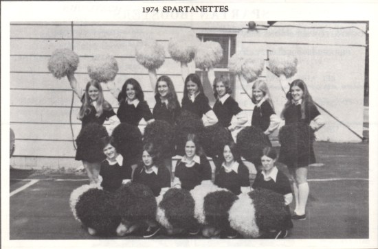
Spartan Boosters with photo of the Spartan cheerleaders, the Spartanettes.

Spartans football action shot.

The Spartanettes.

West Allis Spartans, Inc. officers, board of directors, stockholders.

Back cover “Go Spartans!’ ad from Post Publications (West Allis Star).

Unique Way To Display Your Button Or Pinback Collection

I spotted this clever display idea at a local antique mall: the dealer has put a selection of collectible pinbacks in a birdbath.

At home, of course, this might present a dusting problem (always the bane of collectors!), but if you used a sturdy cement birdbath, you could place a large round piece of glass or Plexiglass over the top. Like the kind used to make those round boudoir tables.

The clear covers would keep dust, pet hair and other contaminants out (and, if UV protective, damaging sunlight too) while still allowing the collection of vintage lithos, celluloid, and metal pinbacks to be on display. This would work well for housing and displaying vintage and antique buttons and other small bits and bobs too.

Imagine it as an end table, next to your sofa or chair, with a little vintage lamp on top, lighting the contents, inviting guests to look inside. A very charming conversation piece!

Vintage Central States Football League Yearbook: 1972 West Allis Spartans

Until I found these two pro-football yearbooks, I’d never heard of the Central States Football League or CSFL — and I come from real football country; Wisconsin, home of the Green Bay Packers!

I still don’t know much about the league… Seems to have started around 1961 and ended about 1975.  If you have any information, please share it in the comments.

Below are a bunch of scans from the 1972 yearbook or program for the West Allis, Wisconsin, team the Spartans. (Because there are so many scans, I’ll be sharing the other vintage football yearbook in a separate post.)  I’ve concentrated on the player photos and bios, team and league stats, coaches and staff, etc., but I couldn’t resist tossing in a few of the local ads too. If you’d like to post or share these scans, please credit them with a link to this post — thank you!

1972 Pro-Football Yearbook for the West Allis Spartans

The Central States Football League In Brief, by Jordan Kopac, General Manager

Dan Celoni and Tony Catarozoli

Tom McKinney and Robert Daley

Jim Traskell and Marvin Waters

Vaughn Chattman and Greg Lehman

Ted Dyrnda and Rick Kujawa

Randy Letsch and Mike Heckel

Errol Barnett and Benjamin De Leon

Bob Lowery and Richard Joy

Al Charnish, Greg Braun, Gary Zauner and Michael Dressler

John Hammer, Willie Dixon, Paul Lathrop and Ron Bruce

John Lisinski, Fran Charland, Michael Chowaniec and Mike Gallo

Pete Bock and Ed Carufel

Jim Glembin, Gary Bosack, George Grbich and Terry Fredenberg

Rick Palmtag and Chris Spolum

1972 Spartan team “rooster,” err, roster.

1972 West Allis Spartan team photo.

1972 Central States Football League Schedule

Coaches and Staff: Harry Gilbert, Head Coach; Ed Bolch, Backs & Receivers; Al Tratalli, Line Coach; Joe Bukant, Consulting Coach; Jordan Kopac, Defensive Coach & General Manager; Grayle Balkman, Head Trainer, with assistant Ralph Morbeck; Ed Kozak, Assistant Equipment Manager; Frank Kopac, Equipment Manager; Clifford Street, Water Boy; George Gjuran, Ball Boy.

“1972 A Whole New Ball Game” Allis-Chalmers Ad

Fair Finance Corp. ad (with photos of Don J. Ripp and Sally E. McNamara) and photo of the Spartanettes cheerleaders.

Photo of team mascot on horseback: “The West Allis Spartan Pauses To Watch The Action.”

CSFL League Stats

Candid photo of All-pro Tom McKinney and Rich Kujawa with equipment.

Photo of the official play by play anchorman for the Spartans, Hal Walker of WISN.

Game-action photo with caption: “Spartans Fans will never forget the great running ability of Ron Ternouth, retired this year because of injuries.”

Full -page ad for Ira Fistell and Ted Moore of WEMP radio.

Reminder ad for season tickets and the big Madison game at Marquette Stadium.

Again, if you wish to post or share these images, please credit by linking to this post.

A Word From The Spartans’ Chairman Of The Board, Milton Mendelsohn, and a list of the members of West Allis Spartans, Inc.

Vintage Standard Doll Co. Catalog Pages

I don’t only dig through stacks of old magazines and papers; I go through them, page by page. How else would I find this page listing Virginia Lakin publications? (More scans from that booklet here.)

Found inside this 1977 Standard Doll Co. catalog, along with this page of Kate Greenaway postcards, miniature patterns, dollhouse items, etc..

Vintage catalogs are great ways to help date and identify what you have — and identify other items you need for your collection. *wink*

What I Dig Through

What I Dig Through

As an antiques dealer, or picker, I spend my days digging through great volumes of stuff trying to find the things collectors want.


On any given day, I might be at an auction, sorting and sifting through the items and boxed lots and waiting for specific items to go up for bidding. I might be driving around, going from rummage sale to garage sale to yard sale, looking over all the used clothing and household items for the vintage collectibles and antiques. I might spend hours at a single thrift shop, sorting through, piece by piece, thousands of old crafting booklets (see photo). I might be waiting in the snow for my chance to enter an estate sale. I might be waiting in the rain (or, if I’m lucky, in my car waiting out the rain) at a flea market. I might be on the way home from the grocery store and find myself stopping for an impromptu dumpster dive or negotiation with a guy just cleaning out his garage.

Such glamorous work, right? *giggle*

Most collectors appreciate these efforts and understand that’s why prices are what they are; I am paid, in part, for my efforts in finding the collectible needle in the proverbial hay stack. Collectors know how much work this is because they’ve done it themselves. Collectors pay not only because I was the finder of the keepers, but because they may not have the time to search as many places, for as many hours, as I do.

But…

Have you ever noticed the number of people who complain about prices dealers ask for?

Not just comments made in antique malls and flea markets, but the accusations made in comments left at blog posts and forums about collecting television shows?

People seem so outraged that pickers, auction buyers, dealers, pawn show owners, et al want to buy low in order to turn a profit. As if they would sit on a floor at a thrift shop, sorting through every single craft booklet, for several hours — on the chance they’ll find anything interesting. And, should they find something deemed worthy, take the gamble on the investment hoping for a return if and when another person finds it worthy of their own collection.

If these people who complain about the unfairness of pricing had ever put in such time and effort, well, they wouldn’t complain!

(And, of course, dealers also have overhead or costs of doing business. Whether it’s a physical shop or selling online, there are costs beyond the initial cost of the item.)

I know most of you reading here are collectors — and many of you are pickers and dealers too. So you get all this. But sometimes a girl just has to defend the realities of collecting, to vent a bit. Even if it is like preaching to the choir. *wink*

(Feel free to vent yourself by leaving a comment!)

Vintage Birthday Greetings From Goldilocks & The Three Bears

This vintage greeting card has birthday wishes from Goldilocks and Mama Bear, Papa Bear, and Baby Bear, aka The Three Bears.

Along with the cute illustrations (there are even three bowls of porridge on the back!), this card opens to reveal a four-page storybook!

The story is, naturally, of Goldilocks And The Three Bears.

The back of the card only bears the stock number (565) and Made in U.S.A., but the back of the little story-booklet (also marked 565 and made in the U.S.A., so it’s surely its original mate) says the copyright belongs to A.G.C.C., 1949.

A.G.C.C. made several versions of these greeting cards for children with nursery rhyme story inserts — a great way to begin collecting vintage greeting cards!

Now in our Etsy shop.

Pawn Queens Becomes A Series

Via Entertainment Weekly, news that TLC has picked-up episodes of Pawn Queens.

Stating that the two episodes I reviewed, which aired back-to-back, was a “special,” TLC has committed to an eight-episode series order.

I’m excited to see Pawn Queens return to the air (but remain appalled by the sexist comments that continue to poor in about the show).

No word, yet, on TLC’s other antiques and collectibles special/show, What The Sell?!

Vintage Indianapolis 500 Ephemera

Inside the February 1961 issue of Magic Circle, a publication of Perfect Circle Corporation, a contest to win tickets to the Indy 500 and/or a 1961 Thunderbird.

I’m guessing the original owner of this vintage magazine never entered — because the official entry form was still inside the magazine, unused!

PS Here’s another clipping from this issue.

American Pickers’ DVD Giveaway!

In celebration of Season Two, and all things American Pickers, we’ve been given two copies of American Pickers: The Complete Season 1 to giveaway!

American Pickers is the antiques and collectibles show on the History Channel, featuring childhood buddies turned business partners Mike Wolfe and Frank Fritz who travel the country “picking,” hoping to find treasures among the trash.

And they don’t mind having a little fun — even at their own expense — as they do it.

Frank & Mike As Laurel & Hardy

But you fans already know this and just want to hear how you can win the DVD. Even those who haven’t yet seen the show want me to get on to the contest details. *wink*

How can you be one of the lucky winners?

It’s easy! Leave a comment here, telling us your favorite American Pickers moment, find or favorite thing about the show in general. Or, if you’ve not yet been able to see the show, tell us one of your favorite things about Inherited Values.

You can also get extra credit by entering in these additional ways — use them all, or take your “pick.”

* Blog about this giveaway, giving your answer (favorite thing about American Pickers &/or Inherited Values) and linking to this giveaway post. Then come back and leave the URL of your post as a comment.

* Follow Inherited Values on Twitter, @InheritedValues, and let us know by leaving a comment here, including your @twitter handle.

* Tweet about the contest simply by tweeting this:

Win @americanpicker DVDs from @InheritedValues Enter #giveaway here: http://tinyurl.com/663z933

You can Tweet twice a day.

* Follow or “like” Inherited Values at FaceBook.

* Follow or “like” American Pickers at FaceBook. (Be sure to leave a comment with your FaceBook ID so we can confirm your entry!)

Fine Print Rules:

This contest giveaway is open to those who reside in the US &/or Canada.

Since there are two DVDs, there will be two winners; one copy per winner.

Entries must be received/posted on or before February 2, 2011 (that would be midnight, central time, on February 1, 2011). Only entries as described above, will be included in the random draw.

Scene From Season Two Of American Pickers

Talk About Hot Legs!

I’d love to add this vintage Gotham Gold Stripe stockings matchbook (circa 1930s) to my meager matchbook and advertising collection — the little stocking-covered leg matches would be nice sitting next to my lipstick matches, right?

Vintage Gotham Gold Stripe matchbook photos via rcktmn714.

Antique Dutch Dollhouses Fit For A Czar?

Below is a scan from the December 1923 issue of The Mentor; the page is an article by Vincent Starrett entitled A Doll’s House Built For The Czar Of Russia:

As usual, the discovery of this article about an exquisite eight-foot tall, six feet wide dollhouse leads to something even more fascinating than supposed!

The article tells the story of Peter The Great who “was living in Holland as a young man of twenty-four, working at various jobs to acquaint himself with the arts, commerce, and industry of the Dutch” and “chanced to see one day a tiny model of a seventeenth-century dwelling, and promptly fell in love with it.”

“No matter what the cost,” he declared, “I must have one like it.” But the miniature house and its lovely furnishings were not for sale, and the creator would make none for pay. The artisan’s name was Brandt. He was a successful merchant of Utrecht, who, having amassed a fortune, had retired from business and in his leisure made diminutive houses, furniture, toys, and ornaments for his amusement.

The article continues to say that Brandt’s creations “became the rage.” His hobby of making “exquisite toys” and “houses of Lilliputian dimensions” quickly provided him with a market, and possessing one of his creations “became a passion, and fashion, with collectors.”

The Antiquarium Museum at Utrecht, the old Dutch university town, still treasures one of Brandt’s sumptuously furnished little dwellings, with thumb-nail paintings on the wall by Dutch celebrities. It was probably this very model that so enchanted Czar Peter and stirred his desire to own one like it.

So, the article goes, Brandt graciously offers to make one of the dollhouses for Peter, “a little palace excelling all others in delicacy an ingenuity of workmanship, furnish it appropriately, and equip it with all the necessaries of life in a patrician Dutch household of the times.”

With his own hands he constructed a three-story house of about six feet wide. All of the furniture it contained was made by him. He made the molds, which afterward he destroyed, for the articles of plate and for silver and copper utensils. Regardless of expense, he had suitable carpets manufactured, and ordered chests of table and house linen woven in Flanders. The books that filled the miniature library shelves came from Mayence; each volume had golden clasps and was of a size to be enclosed in a walnut. The hanging chandeliers and services of glass were of Dutch manufacture; in the picture gallery paintings two inches square adorned the walls.

For twenty-five years Brandt labored to create this royal gift. At last he sent word to the Czar that the task was completed. His townsmen protested against such a masterpiece being lost to the country, but the model had been promised to the monarch, and Brandt had expended effort, time, and a small fortune to redeem that promise.

When Peter received Brandt’s message he had just concluded an advantageous peace with Sweden and was turning his attention to conquests in the East. But he had not forgotten the desire he had expressed a quarter of a century before, and he directed that a reply be sent asking what he would have to pay for the possession of the masterpiece. Deeply offended at Peter’s gross tactlessness and disposition to bargain, Brandt replied that even a czar had not money enough to pay for twenty-five years of a man’s life. Forthwith he presented the house to the nation. It is now in Amsterdam in the Royal Museum, none of whose treasures better exemplifies Dutch patience, industry, and love of decoration than the little house that Brandt build for Peter the Great.

That’s where the article ends — but my work begins.

If I thought I could just post this scan from a vintage magazine and, should I be so lucky as to find it, include a link to the czar’s dollhouse at the Royal Museum, I was to discover differently.

Yes, there’s an antique dollhouse at the Rijksmuseum — and it looks to be the same one shown in this articles photo (minus the glass doors on the cabinet — but the furnishings are too specific to be another dollhouse, and the dimensions are about the same), but from there it gets weird…

The museum doesn’t credit the maker of the dollhouse, but it does specify the owner as Petronella Oortman. Oorman was married to a silk merchant named Johannes Brandt — is that were the name Brandt comes from? If so, that might be explained away easily enough, I suppose… But given the strong relationship between Holland and Peter the Great, certainly if this dollhouse — or any dollhouse — had any connections to the czar, the museum would mention it.  …At least I think so.

There’s another fabulous antique dollhouse, this one was owned Petronella de la Court, that sits on display at Utrecht’s Centraal Museum.

I don’t know if this is the other “Brandt” Dutch dollhouse from the “Antiquarium Museum” at Utrecht that Starrett, in The Mentor article, suggests “enchanted Czar Peter” or not, but it certainly is enchanting.

In The Speaker (Volume 11, 1905, Mather & Crowther), Edward Verrall Lucas writes of an antique dollhouse from the same Dutch craft period.  I feel compelled to share a snippet not only because it might just be the de la Court dollhouse and the “Antiquarium,” but for the author’s descriptions.

At the north end of the Maliebaan is the Hoogeland Park, with a fringe of spacious villas that might be in Kensington ; and here is the Antiquarian Museum, notable among its very miscellaneous riches, which resemble the bankrupt stock of a curiosity dealer, for a very elaborate dolls’ house. Its date is 1680, and it represents accurately the home of a wealthy aristocratic doll of that day. Nothing was forgotten by the designer of this miniature palace ; special paintings, very nude, were made for its salon, and the humblest kitchen utensils are not missing. I thought the most interesting rooms the office where the Major Domo sits at his intricate labours, and the store closet The museum has many very valuable treasures, but so many poor pictures and articles—all presents or legacies—that one feels that it must be the rule to accept whatever is offered, without any scrutiny of the horse’s teeth.

(This piece by Lucas, with a stated copyright of 1904, appears to be what he published as a book in 1906, A Wanderer in Holland (Macmillan) — just in case you’d like to read more.)

Starrett never mentioned nudes paintings in the old Dutch dollhouse — but maybe he was less flappable in the Roaring Twenties than Lucas was at the turn of the century. And the commentary on the museum itself is rich — Lucas could be describing a lot of my collection and collection practices! *wink*

But still, the whole point of Starrett’s little story was right there in the article’s title, that the dollhouse shown had been made in Holland for Peter The Great; yet I could find no connection between Peter and Dutch dollhouses whatsoever.

So, I continued to research, like any obsessive would do.

I then found this bit in Dutch And Flemish Furniture, by Esther Singleton (The McClure Company, 1907):

In the Rijks Museum are several models in miniature of old Amsterdam houses. The finest one is of tortoise-shell ornamented with white metal inlay. According to tradition, Christoffel Brandt, Peter the Great’s agent in Amsterdam, had this house made by order of the Czar, and it is said to have cost 20,000 guilders (£2,500), and to have required five years to produce.

There’s that name, “Brandt,” again.

Or maybe not.

Seems the name of the czar’s Netherlands associate was actually Christoffel Brants, aka Christoffel van Brants after Brants was knighted by the czar. And while it seems Peter received actual houses from Brants, there’s still, no mention of houses specifically for dolls.

So, without further documentation, I’m left to conclude that Starrett’s story is just that, a story. (The man did love his stories! Among other things, Starrett collected books and was a Sherlock Holmes scholar.)

Or maybe you’d prefer the terms Singleton uses, “tradition.”

Either way, that would explain a number of things, such as the name Brandt being recalled, even if inaccurately, and the number of years it took to create the dollhouse changing by five-fold.

However, by the 1950s this traditional story of Peter The Great’s Dutch dollhouse has changed a bit with the telling… As most legends do.

In 1958, many American newspapers ran what appears to be a wire story; the uncredited story is exactly the same in each vintage publication. Here’s a copy from Kansas’ Great Bend Daily Tribune (June 22, 1958) — which reads pretty much like copyright infringement case for dear old Starrett (unless he was the one paid by the wire service), except for the first two lines:

Once there was a dollhouse so lovely that the czar of Russia, Peter the Great, wanted it very much. He hadn’t money enough to buy it however, believe it or not!

Cold war press copy conveying the anti-Russian sentiments, perhaps?

Then, in South Dakota’s The Daily Republic, February 19, 1977, the legend of Peter the Great’s Dollhouse gets tweaked again:

Those dollhouses were so expensive that only a few people could afford them. Peter the Great of Russia once ordered a dollhouse but when it was delivered, he refused it. The price was just too much.

The czar may have ordered and owned at least one fine Dutch dollhouse; but I can’t find any proof.

(See, I’m not just obsessive with my research as some sort of personality quirk; it’s necessitated!)

The Stuff Collectors Nightmares Are Made Of

Picture it… A vending machine filled with glassware, china, and porcelain figurines… You insert a coin, a piece of fragile china slowly moves forward — only to fall into the bottom of the machine, breaking.

Calm down — it’s only art!

A set of three interactive sculptural pieces by Yarisal and Kublitz. Called Passive/Aggressive Anger Release Machine, the artists claim that once you deposit the coin and shatter the breakable the experience leaves you “happy and relieved of anger.”

I doubt that it works for collectors of glassware, ceramics, pottery, etc.

This post brought to you by best online casino.

HGTV’s Cash & Cari

When I first heard about HGTV’s Cash and Cari, I got a little excited thinking this show might focus more on decorative collectibles, plus offer a splash of do-it-yourself (DIY) home decor creativity. While the show has all that potential, I really was disappointed.

Cash and Cari (Cari is not pronounced like “carry,” but like “car” with an “e” on the end, so it’s not quite the pun your eyes expect) follows the work of “estate sale guru” Cari Cucksey of Michigan’s RePurpose Estate Services.

If you like watching how to set up an estate or rummage sale, then maybe you’ll like this. However, for me, the show lost points when it dropped a standard part of the collectible shows format: the visit with the expert or in depth look at a few items. I realize this part of the show’s time was given to the DIY component — and that was something I was looking forward to; but in this particular episode this segment infuriated me.

In this debut episode, Cari purchases an older used bench for $40 and has a staff member give it “an impressive makeover.” The makeover consisted of repainting the bench, removing the older upholstered seat, and replacing it with new fabric — sewing a decorative throw pillow to match. However, the new “upholstery” job was terrible.

The fabric was staple-gunned in place and the staples hidden from view by hot-glue-gunning some sort of open-weave rick-rack lace over it. Use of a glue gun on the seat of a bench in place is anything but quality. (The dried glue will be lumpy, visible, and likely to peel away if the object has any use whatsoever ; it’s not appropriate for furniture or seating or anything besides the purely decorative.) Anything but quality and certainly not worth, in my opinion, the $300 they proposed to sell it for. Normally I don’t like to argue the price someone gets for something; different location alone can create marked price differentials. But this bench was really a shoddy DIY job and not fit for an audience of antiques and vintage collectibles fans.

Collectors of antiques are looking for quality.

Plus, the item was to be sold at “the shop,” and it kind of makes you wonder how the bench will be presented there… As an antique or vintage piece, or as a quickly made home decor piece? It’s the sort of thing an experienced collector wouldn’t be fooled by, but it’s also the sort of thing, like reproductions offered for sale, that most collectors want to know are properly represented so that no one feels tricked. No mention of this — after such a cheap makeover, weakens Cari’s credibility.

Yes, I watch a lott of the collectibles shows, and I did consider how potential “burn out” might be coloring my thoughts about Cash and Cari; but I don’t think that’s it (see my post about Oddities).

Where Cash and Cari suffers is a lack of focus on what makes the other shows great (personalities and drama of “cast,” information segments, &/or presentation of values of items) and a complete fumbling of the potentially fabulous DIY segment.

In trying to be kind, I wished HGTV had, as many of the other networks have, given us more than one episode to watch so that I could see if another episode could make me a fan… But then I realized HGTV thought this episode was strong enough to be the series lean-in and if that was their best foot forward, I don’t think I’ll watch another episode.

Collections In Old Shoeboxes

Shoebox

I just put an empty shoebox in my son’s room. Why? Because every kid should have empy shoeboxes to fill.

I remember as a kid all the services shoeboxes had.

Some held saved greeting cards, playing cards and jokers, and other bits of ephemera grown-ups needed not to see when they came to supervise room cleaning.

Other boxes held Barbie’s clothes — especially those I made out of hankies and safety pins and whatnot and so could not easily be stored on the hangers in her houses.

My little plastic horses didn’t have fancy play or storage sets, so shoeboxes took care of those needs.

And once I found the coolest blue metallic beetle-bug outside and I kept it in the shoebox under my bed, sorry mom & dad. (Don’t worry; he didn’t get out in the house. He died in there and that made me so sad that from then on I only played with such things on the screened-in sun porch… I bet you remember my inchworm “habitats” — and that each and every inchworm went back outside after I played with them. Lesson of the shoebox bug learned.)

My point is that each shoebox was like a treasure chest, full of a child’s idea of booty. Inside each cardboard container, secrets were kept, preserved, and most important of all — the prizes remained protected from the prying eyes of parents and siblings alike (any of which had their own motives for plundering).

Shoeboxes contained, preserved, and, because they were so innocuously portable, even displayed the tangible relics of our soles souls. Filling your father’s empty shoeboxes was like the antidote for “filling your father’s shoes.” Each box was all about you.

I’ll confess that I’ve saved one such shoebox collection of my own…

Childhood Shoebox Collection

It’s not the actual same shoebox I used as a child.  But as I down-sized the boxes through the years, these are the bits and bobs I saved… My old playing card jokers;  two of my most beloved plastic toy horses , Sugar and Flame; Sugar’s saddle and hitching post; a small horse head I made in art class; and a few other assorted pieces of ephemera.  And when I found myself with such a little bit to save, I grabbed the nearest shoebox and I knew my childhood pieces had found their home. (I swear Flame and Sugar whinnied in appreciation!)

My adult self knows that cardboard boxes aren’t the best long term storage solution options for most things aged and fragile, especially paper. But the amazing thing about shoeboxes is their ability to hold, preserve and maintain the memories and all the joyful magic of childhood inside them — no matter how many years pass.

I strongly encourage you to save your shoeboxes. Give them to the children in your lives. And, if you have not already done so, be sure to save a few for yourself.

Make a time capsule of your childhood, start a new secret collection, recapture the joy of collecting in a shoebox.

Discover(y) The Oddities

You might just think I’d be tired of watching and reviewing all these antique and collectible TV shows — so tired of them, in fact, that I’d be dreading yet one more. But if that’s what you were thinking, you’d be wrong; Discovery Channel’s Oddities has become a favorite “can’t miss” in terms of my television viewing.

On Oddities, we watch the on-goings of the owners (Evan Michelson and Mike Zohn) and staff (Ryan Matthew and Ersan, intern aka The Cerd) of Obscura Antiques and Oddities, a shop located on New York City’s East Village, dedicated to “the weird world of strange and extraordinary science artifacts.” Here you’ll find the more eclectic and shall we say less mainstream antiques and collectibles, such as antique medical devices, anatomical art, sideshow relic taxidermy.

Some of my personal highlights:

An ancient Egyptian mummy hand — which is notable alone for the one time in one of these shows I’ve seen the expert put on gloves. Plus, we hear from that museum professional that his coworker actually has a taste test for authenticating mummies; too bad she wasn’t around that day. But even if it is authentic, is it legal to sell? …Oh, now that’s another interesting turn.

Rachel Betty Case brought her “human ivory” artwork — made from human fingernails (well, and toenails, and pet nail clippings); which I found fascinatingly beautiful.

A guy who wants a bug to scare his wife with; another man who wants the perfect creepy dental gift for his retiring dentist friend.

I’m not sure I even want a two-headed cow or four-footed chicken taxidermy piece… But if I did, I now know better how to tell if such a thing is due to an animal with an authentic genetic defect and not some fake.

And Laura Flook, embalmer turned model come fashion designer. Yup, you read that right. Flook is at Obscura looking for a mortuary table for her fashion shoots. As Ryan says, “One interesting thing about Laura is her devotion to art whether it’s a mortician, model or a clothing designer.” So devoted, yet this designer of clothing inspired by Victorian-era mourning wear is dreamily flabbergasted when she returns to Obscura in another episode to discover corsets. Admittedly, one of the medical corsets is not the normal corsetry that springs to mind; but she buys one that I’ve got in my own collection. This Flook is fascinating to me… The way she talks, everything. I hope she returns in future episodes.

Along the way there are also various circus performers (sword swallower, escape artist, etc.), theatre folk (an unusual playwright, a performer who uses blood to increase the drama), and some more mainstream celebrities (not unusual given the name dropping at the Discovery Channel’s site).

Oh, and yeah, there are the collectibles too. From horrifying medical implements to medical quackery devices, from odd little vintage toys and masks to coffins (cradle to grave, I tell you!), and other assorted (or is that a-sordid?) pieces of history.

Another great feature of this show is it’s ability to leave the shop.  It’s because of that we not only see the great lengths the staff goes to in order to procure an object for a collector, but we see the fabulously odd collections of others.  That’s something missing from most of these shows.

But with this Oddities, you definitely come for the surprises. Even if you come for the antiques and collectibles, you’ll find your intrigued by a lot more; and that’s a surprise too, right?

Because the items themselves are more dramatic, the majority of clientele themselves more interesting, there’s no need for the cast to be fraught with personality dramas, or for the show to bilk the monetary value. (Honestly, this is one area where the prices seem too low to me; the items are that, well, obscure!) So while this is part of the same genre of collectibles programming, it’s not quite the same trite formula. And it’s done absolutely right.

Oddities can be seen on Thursdays at 10:30 p.m. E/P on the Discovery Channel and also on its sister channel, the Science Channel, Wednesdays at 9 & 9:30 PM E/P. Join me in watching it — at least once!

The Mentor Magazine

The Mentor magazine is an obscure vintage magazine for several reasons: The creator’s intentions, its various incarnations, and rather shoddy historical record (it is not listed in the National Union Catalogue of Periodicals).

The publication begins with William David Moffat. Moffat attended Princeton; while in school he has several works published, mostly sports stories for boys under the name William D. Moffat. Upon his graduation in 1884, he went to work for Scribner’s where he’d stay for two decades, working his way up from sales, to the education department and finally the business manager for The Book Buyer and Scribner’s Magazine. In 1905 he leaves Scribner to form his own publishing house, Moffat, Yard & Company, with fellow Princeton alum Robert S. Yard. By June of 1912, Yard was no longer active in the company, and Moffat, Yard & Co. announced it was moving in to share the offices of another publishing house, John Lane Company. While this was said not to be a true merger, but rather a shared management and expenses sort of a thing, it is at this time that Moffat begins The Mentor Association.

The Mentor Association is rather like Moffat’s attempt at a think tank. He gathers men who were specialists in their area and, with himself as editor, they proceed to share their information in a publication so that persons might “learn one thing every day.” This publication was The Mentor. Here’s how the association and publication were described (taken from The Mentor, Volume I, Number 38, November 3, 1913):

The purpose of The Mentor Association is to give people, in an interesting and attractive way, the information in various fields of knowledge that they all want and ought to have. The information is imparted by interesting reading matter, prepared under the direction of leading authors, and by beautiful pictures, produced by the most highly perfected modern processes.

The object of The Mentor Association is to enable people to acquire useful knowledge without effort, so that they may come easily and agreeably to know the world s great men and women, the great achievements, and the permanently interesting things in art, literature, science, history, nature and travel.

…We want The Mentor to be regarded as a companion. It has often been said that books are friends. We give you in The Mentor the good things out of many books, and in a form that is easy to read and that taxes you little for time. A library is a valuable thing to have if you know how to use it. But there are not many people who know how to use a library. If you are one of those who don t know, it would certainly be worth your while to have a friend who could take from a large library just what you want to know and give it to you in a pleasant way. The Mentor can be such a friend to you.

And since the word “library” has been used, let us follow that just a bit further. The Mentor may well become yourself in library form. Does that statement seem odd? Then let us put it this way: The Mentor is a cumulative library for you, each day, each week a library that grows and develops as you grow and develop a library that has in it just the things that you want to know and ought to know and nothing else. Day by day and week by week you add with each number of The Mentor something to your mental growth. You add it as you add to your stature by healthy development; and the knowledge that you acquire in this natural, agreeable way becomes a permanent possession. You gather weekly what you want to know, and you have it in an attractive, convenient form. It be comes thus, in every sense, your library, containing the varied things that you know. And you have its information and its beautiful pictures always ready to hand to refer to and to refresh your mind.

So in time your assembled numbers of The Mentor will represent in printed and pictorial form the fullness of your own knowledge.

It is also in this issue, that The Mentor gets a new look:

We have chosen this cover after a number of experiments. It has not been an easy matter to settle. The Mentor, as we have stated more than once, is not simply a magazine. It does not call for the usual magazine cover treatment. What we have always wanted and have always sought for from the beginning has been a cover that would express, in the features of its design, the quality of the publication. In the endeavor to make clear by dignified design the educational value and importance of The Mentor, the tendency would be to lead on to academic severity and that we desire least of all. On the other hand, it would be manifestly inappropriate to wear a coat of many colors. The position of The Mentor in the field of publication is peculiar its interest unique. How best could its character be expressed in decorative design?

We believe that Mr. Edwards has given us in the present cover a fitting expression of the character of The Mentor. It is unusual in its lines that is, for a periodical. It has the quality of a fine book cover design at least so we think. It will, we believe, invite readers of taste and intelligence to look inside The Mentor, and as experience has taught us, an introduction
to The Mentor usually leads on to continued acquaintance.

Originally The Mentor was a weekly, published by the Associated Newspaper School, Inc. (New York City) and hardly more than a pamphlet or folio; a dozen or so pages with “exquisite intaglio gravures” loose inside. (The fact that these images were not bound in the publication means issues are often found incomplete.) Each slim issue was on a specific theme and there were tie-ins with newspapers, adding to The Mentor‘s educational publication feel.

From a practical standpoint, the narrow focus of each theme likely complicated or limited the periodical’s circulation numbers. It’s one thing to say your publication is “an institution of learning established for the development of a popular interest in art, literature, science, history, nature, and travel,” but with such issue-specific themes, readers may have done what collectors who spot copies do today: Pending the theme, either fell in love or turned up their noses and eschewed the entire publication.

(Most collectors seem to covet The Mentor on an issue by issue basis; seeking out the single issue the theme of which suits their collecting interest, or coveting the January 1929 issue on Famous Collectors & Collecting.)

Perhaps this is why in its second year, The Mentor ceases weekly publication and lowers costs by being published only twice a month.(Subscription fees change from $5 to $3 a year.) It still retains the single theme per issue, but perhaps the frequency of publication change is also seen as a better way to market itself. It is also at this time that the publisher is changed from Associated Newspaper School to The Mentor Association.

By mid-1919 wartime inflation would forced the price of subscriptions to The Mentor to increase to $4 per year — but bigger changes were coming.

It was during this time that The Mentor becomes a monthly and introduces more color on the covers.

In the October 1920 issue, the magazine increased the number of pages to 40 and, finally, the six gravure pictures were bound into the center of the magazine, becoming numbered pages in each issue. It is also at this time that The Mentor softens its strict each-issue-devoted-to-a-theme stance, allowing the last five pages of each issue to free of the main topic.

In 1921, The Mentor is purchased by Crowell Publishing Co. with W. D. Moffat remaining on as editor. There are no noted changes until the August 1922 issue’s page size increase. (By the April 1927 issue, the page size of The Mentor would grow to the same size as that time’s Atlantic Monthly.)

In 1929, the 63 year old Moffat is ready to retire as editor of The Mentor. It is in this news bit from Time magazine (August 19, 1929) announcing the change, that we get more insight into the Moffat’s intentions and legacy:

Editor Moffat never aimed at mass-circulation. Even when mass-circularizing Crowell Publishing Co. (American Magazine, Colliers, Woman’s Home Companion) bought The Mentor in 1920, it did not commercialize original Mentor ideals, but retained Editor Moffat, continued to please the 50,000, the 70,000, finally the 100,000 who liked The Mentor for what it was.

And now is when the magazine changes significantly; as reported in that same Time article:

Starting with the next (September) issue, The Mentor will no longer have a theme-subject. Instead there will be articles on many a different topic, by such authors as Walter Davenport, W. E. Woodward, Margaret Widdemer, Will Durant. There will be seven four-color pages in place of rotogravure; a cover in the “modern manner”; a history of tennis by William Tatem Tilden, 2nd; a history of dog fashions by Albert Payson Terhune.

To make The Mentor youthful, Crowell Publishing Co. has put a youthful man in the editorship, Hugh Anthony Leamy, just past 30, round-faced, amiable, onetime New York Sun reporter, for the last three years an associate editor of Collier’s. About The Mentor, what its plans are, he will talk with hopeful enthusiasm. About new Editor Leamy he is reticent. “I’m still an untried man at this job,” he explains. “But The Mentor? Well, you know, we thought it best to go through with a big change all at once to keep it up with the changing times. . . . You might call the new Mentor a nonfiction, up-to-date magazine for people who want to learn about various matters, but who want to be amused at the same time—not bored.”

Now The Mentor is printed in the style of that period’s Vanity Fair; from the slick paper and illustrative appearance to the “modern” and “amusing” content, including fiction.

But the dumbing-down and dressing-up didn’t help circulation any; as Time reported in April 21, 1930:

Crowell Publishing Co. employes found an announcement on their bulletin board one morning last week, which read: “The Company has sold The Mentor to the World Traveler Magazine Corp. — George R. Martin, publisher.† They will assume the publishing of The Mentor, beginning with the June 1930 issue. We have become convinced that The Mentor will have a much better opportunity if handled by a publisher equipped to take care of the smaller units. Here we are fully and thoroughly geared up to handle large units and it has become difficult to give The Mentor the necessary small unit attention. We feel that Mr. Martin and his organization are equipped to continue The Mentor successfully.”

…Although the magazine’s circulation reached 85,000, it became apparent that it would never pull in harness with its whopping big Crowell team-mates—Woman’s Home Companion, Collier’s, The Country Home (onetime Farm & Fireside), The American Magazine — whose combined circulation is over 8,500,000.

To World Traveler, the Mentor went lock, stock & barrel—with the exception of Editor Leamy.

…Publisher Martin contemplates fusing his old magazine with his new, placing the amalgam under the direction of World Traveler’s Editor Charles P. Norcross, now junketing in the Orient. Because World Traveler has about one-fourth of its stablemate’s distribution, and because when two magazines combine one inevitably swallows the other, publishers guessed that the ever-mutating Mentor would be the one to endure.

† Not to be confused with George Martin, one-time (1918—29) editor of Crowell’s Farm & Fireside.

The publications were combined as The Mentor — World Traveller and given a new look, the pages enlarged to slightly larger than the size of Life magazine. But contrary to what the publishers in that 1930 Time magazine article said, The Mentor doesn’t seem to be the one to have endured. Nor did the The Mentor — World Traveller.

According to Paul W. Healy in The Ecphorizer:

As an indication that the end was not far off, the Reader’s Guide to Periodical Literature stopped indexing the magazine in December 1930. My last issue is January 1931; I have reason to believe it was the last published.

If you have anything to add to The Mentor story, please let us know!

Image Credits:

First issue of The Mentor magazine (Volume 1, Number 1, February 17, 1913) with six gravures via 2010lilbolharsky.

Photo of set of three vintage Mentor issues and April 1930 cover via mom-and-me-1971.

Collecting Children’s Books: Lessons In Rabbit & Skunk

Rabbit and Skunk and the Scary Rock, by Carla Stevens (illustrations by Robert Kraus) is one of my fondest childhood reading memories. Of course, I had completely forgotten about this book until I spotted it at one of those church rummage sales where you pay $2 for whatever you can fit into a paper bag. But the instant I saw that cover, it all flooded back — and I neatly snatched it up and put it in my bag.

I was so excited by the find that I was shocked to discover that neither hubby nor the kids had ever heard of what I consider to be a childhood classic! Apparently it’s been out of print for a number of years now. *sigh* (But you can still find cheap copies at at eBay.)

Remembering reading about Rabbit and Skunk and their fright over the scary talking rock is far more delicious than reading it now; sometimes you really can’t go home again. *deep sigh*

But then collecting children’s books isn’t about reading and rereading them — at least not alone by yourself. No, collecting children’s books is about literally holding-on to those precious literary memories, about the tangible connection to those fragile and magical moments of those early joys of reading… We get to hold in our hands again those things we still hold dear in our hearts.

Rabbit and Skunk and the Scary Rock, for those unfamiliar, was published by Scholastic Book Services, so it was a very early reading experience for me. I remember reading and rereading it, the repetition more than that soothing familiarity children seek, but a mastery of the adventure — with each read I could take myself out there and bring myself back again. All by myself! No longer was I held hostage to the schedules and preferences of others; no longer was I stuck to the confines of my room, my house, my world — I could go anywhere, do anything!

And, just as Rabbit and Skunk discovered, big scary things aren’t always what they seem. You just have to muddle through to the end, that’s all.

Thinking of this reminded me of another childhood favorite: The Monster at the End of this Book.

By the time this book came out, I was way past both Sesame Street and Little Golden Books — but I had younger cousins, and they love-loveloved it when I read them the story of silly Grover’s fear of a monster. How could he be afraid of a monster at the end of the book when (spoiler alert!) he is, of course, a monster himself!

One of the reasons I enjoyed reading this book over and over to my younger cousins was because of its similarity to Rabbit and Skunk’s adventure. There’s the silliness, of course, but primarily the books address fear. My understanding of the concept of fear was, as a young reader, closely tied to the fear of reaching the end. The anxiety of “What would they find?!” was sort of a high… And the resolution rather a come-down. Not specifically because it wasn’t terrifying enough or was anti-climactic in anyway, but because all that good stuff was at an end. (In some ways, that hasn’t changed; I still loath for a good book to end.)

I was then left with a choice, do I read it again or select another adventure? (Never was the choice not to read.) What if the new adventure isn’t as good as the old one? …But, if I read the old one again, what might I be missing? Staying in the middle of a great read, looking forward to the miles to go, is always my favorite place to be.

This confusing pull surrounding endings — even those with new beginnings — is what I find myself struggling with each New Year’s Eve.  If I might be allowed a cynical moment here, I suspect most of us feel that way and that’s why drinking alcohol and partying have become de rigueur; we just are too uncomfortable with “Goodbye.” And facing a “Hello,” even after a bad year, is to wonder if we wouldn’t really be better off sticking with the old one…

But, as this year is about to end, I must remind myself of Rabbit, Skunk, Grover, and reading books taught me. Be brave. Big scary things aren’t always what they seem. Whatever you’re going through, it’s better when you have a friend to share it with. You just have to muddle through to the end, that’s all. And then look forward to the next adventure.

After all, you can’t prevent this New Year from arriving anymore than Grover could prevent the end of the book. So you might as well embrace it. Happy New Year, one and all!

Antique Milton Bradley Dollhouse Ad

This antique Milton Bradley ad was posted in the LiveJournal Vintage Ads Community with simply the date of December 1891; no publication was cited.  I’m fascinated by the concept of another cardboard dollhouse — this one to be played with pictures of furnishings and people cut from catalog pages, not with miniatures and dolls.